Formula 1
The Global Exhibition
- Art Direction
- Brand Identity
- CGI / Animation
- Digital Design
- Environment
- Exhibition Design
- Type Design
The Formula 1 Exhibition is a global show which presents an interactive and immersive journey through the world of Formula 1. Currently in its third year, the exhibition has travelled across five international cities, attracting thousands of visitors to critical acclaim.
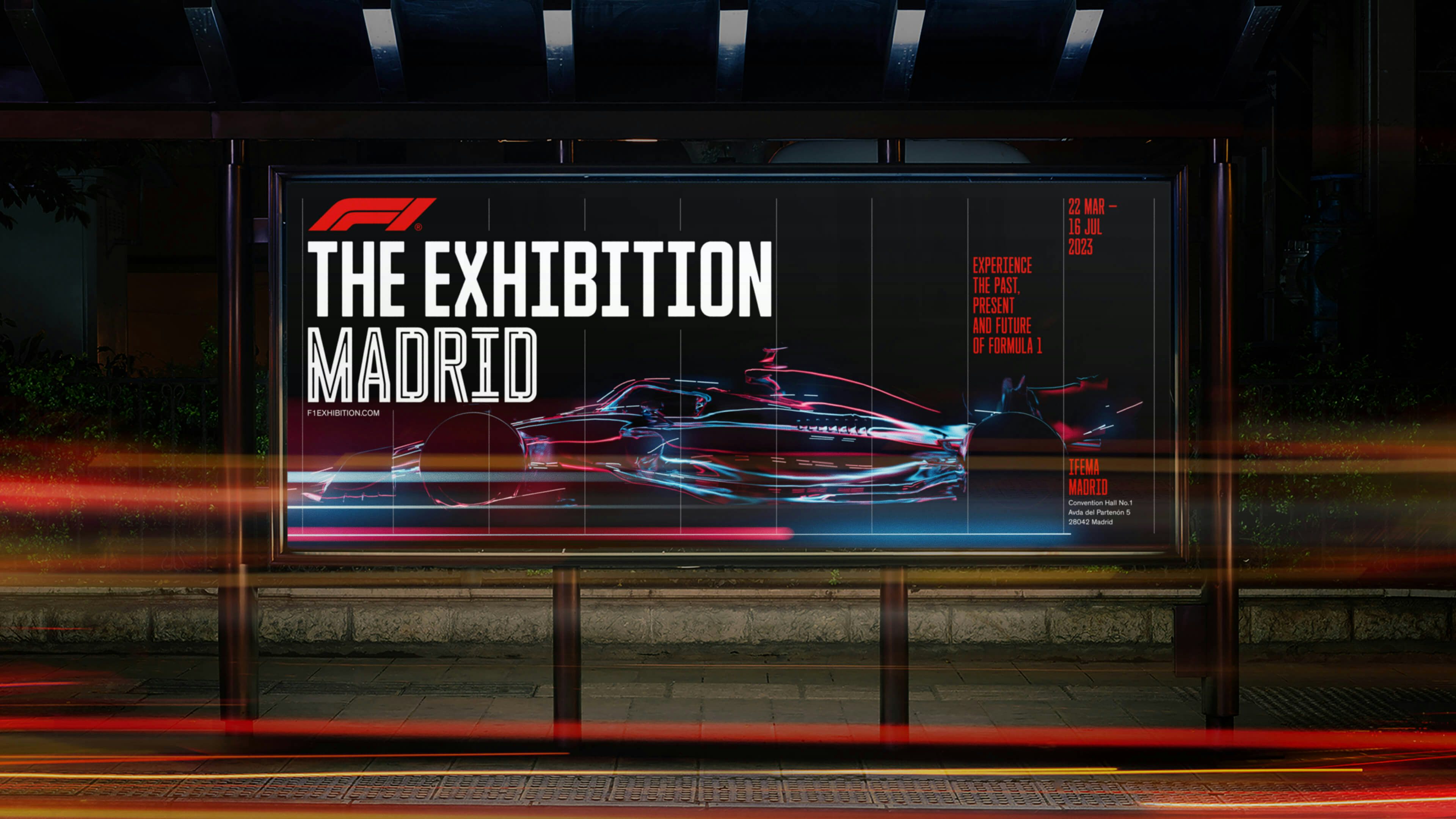
HS created the visual identity system and global campaign for this exciting exhibition. Modular in its construct – the core identity is comprised of a number of interchangeable elements. This flexibility allows the lockup to adapt to the requirements of any host city or venue – where hierarchy and naming can be re-configured to reflect localised nuance.
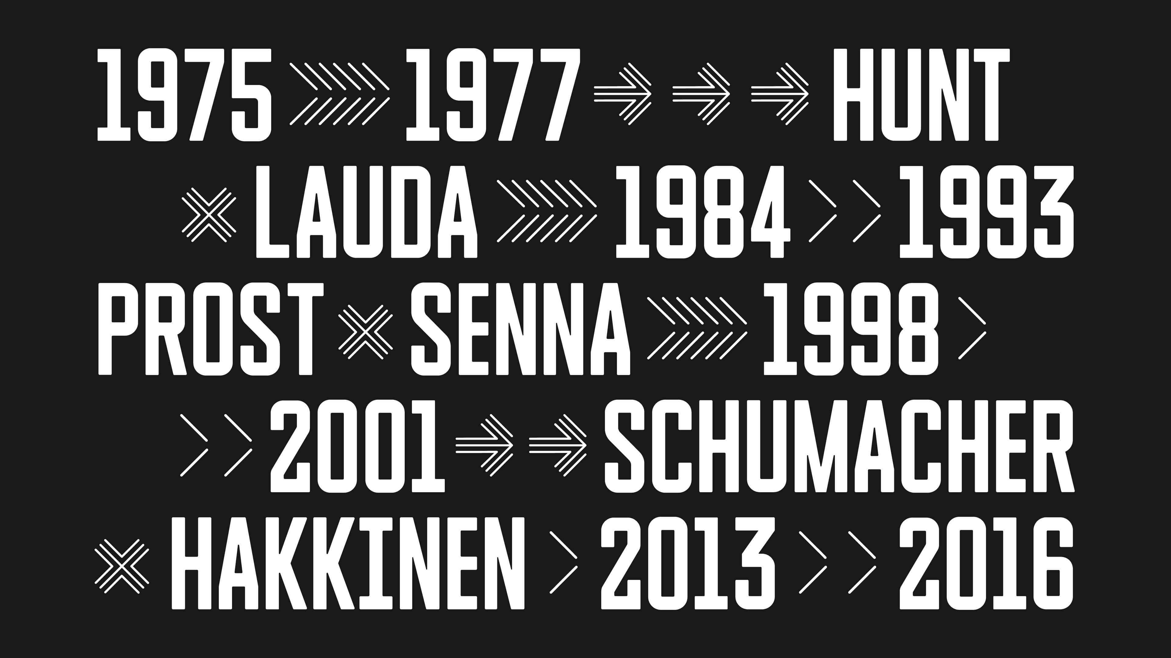
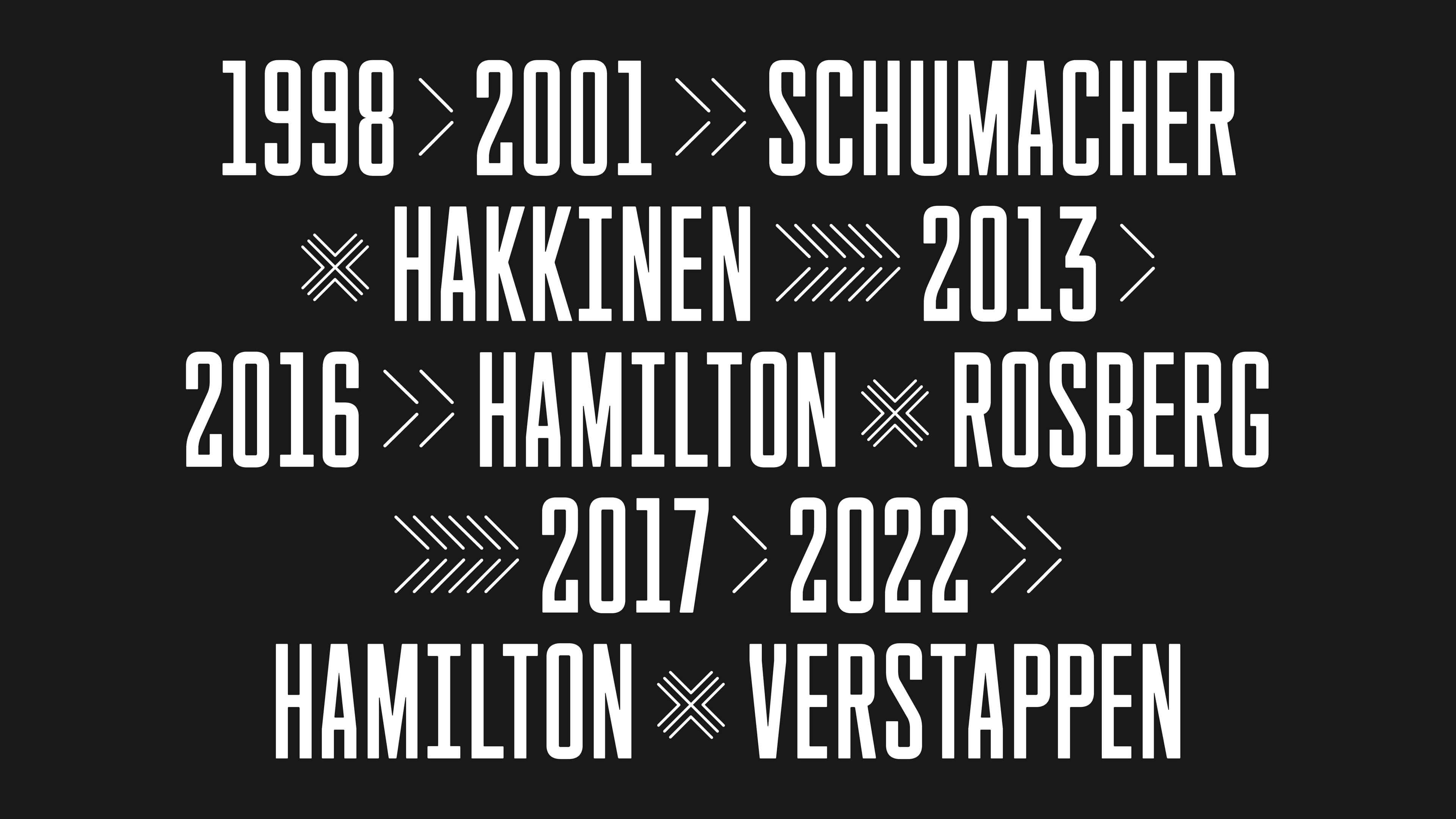
With such a vast and complex narrative to tell, the information architecture was key – the typographic language defined the framework for our entire approach. Establishing a clear visual hierarchy allows visitors to engage with the information at varying levels. Combining top tier, bite-sized information with supporting content for those wanting to dive deeper into specific subject matter.
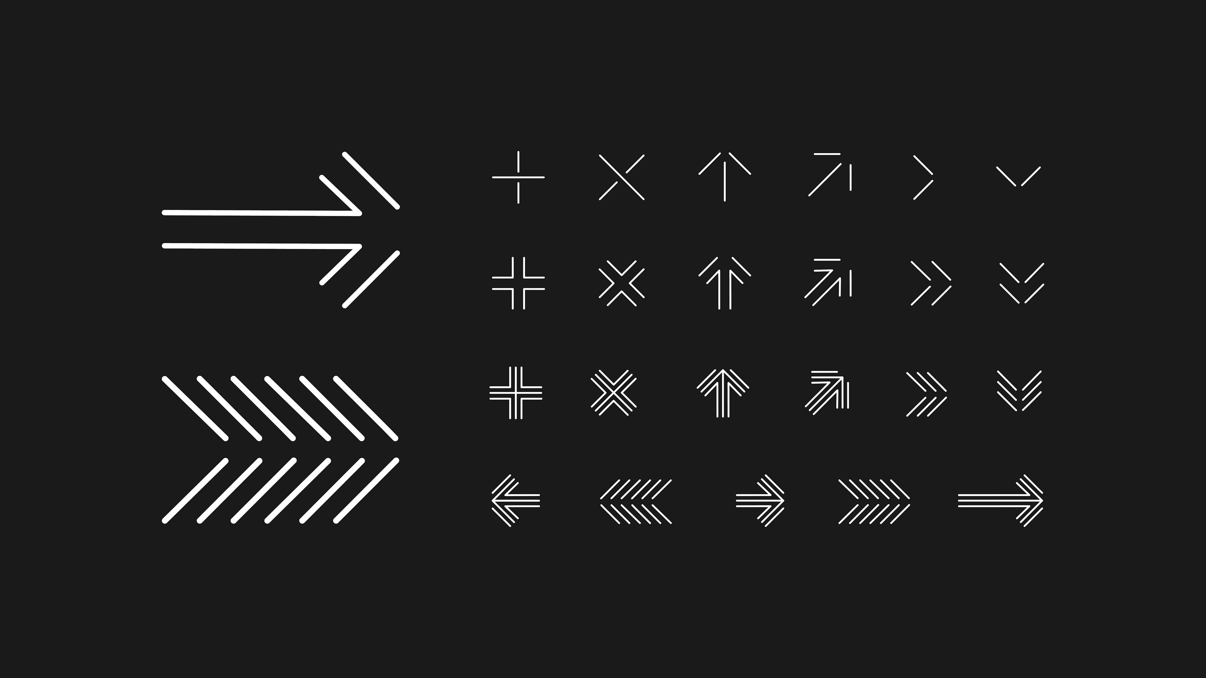
A unique family of bespoke headline typefaces form a central part of the typographic system, comprising three different cuts – Torque 100, Torque 50 and Torque Inline, all designed by Hingston. Each cut was designed to perform a specific function within the show, adapting to the different themes and scales of information. Some rooms, for instance, required Torque to take on unique visual treatments that reflected the specific theme of that space, all while maintaining the integrity of the core typeface. The condensed letterforms make subtle reference to the sport’s history; the golden era of the 60’s and 70’s – whilst evoking strength and modernity. Torque’s geometric details, particularly its circular corners, echo the iconic F1 mark, creating a seamless connection between the sport’s legacy and its current branding.
Meticulous identity guidelines detail how the brand and typographic system can flex across wayfinding, print, digital and environmental touchpoints.
The supporting campaign features our unique interpretation of the F1 car. Created entirely in CG by our 3D and motion team, this dynamic formation of light and data creates a fluid expression of speed, technology and innovation.
Credits
Design and Creative Direction: Hingston Studio
3D/CG Motion Design: Markus Lehtonen at Hingston Studio
Typeface Design: Hingston Studio
Font coding and Engineering: F37 Foundry


Establishing a clear visual hierarchy allows visitors to engage with the information at varying levels. Combining top tier, bite-sized information with supporting content for those wanting to dive deeper into specific subject matter.


